Bar Charts and Slicers for Year over Year Analysis – Power BI

Waterfall Chart – Visualizing accident data with Power BI
January 15, 2024Data Visualization of Yellow Taxis in New York – Python
January 15, 2024Bar Charts and Slicers for Year over Year Analysis – Power BI
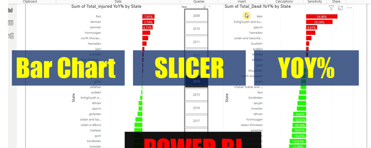
We have a dataset of 14 years of data including injured and dead people in traffic accidents in Iran. we want to know the provinces that had the most increase or decrease number of dead or injured people compared to last year.
We get help from power BI features like bar charts, Slicer and Quick Measure (Year over Year Change – YOY%) In this video, I’ll show you how to use bar charts and slicers to unlock the power of year over year change.
With this information, you’ll be able to see how number of injured people is changing over time and make informed decisions. Using bar charts and slicers is a great way to see year over year change in road safety. This information can help you make informed decisions , including changes you may need to make to roads and traffic policy . By watching this video, you’ll be able to learn how to use bar charts and slicers to analyze accident data.